Why Your Landing Page Converts at 1% (and How to Increase That to 3–5%)
By Saroj Jha · April 27, 2026 · 16 min read
If your landing page is converting at 1%, you're not stuck. For most early-stage companies, 3-5% is a realistic target — often higher for warm traffic.
This article breaks down why you're stuck at ~1% and what to change to move into the 3–5% range — without a full redesign.
Is 1% Actually Bad?
Benchmarks depend on:
- Traffic quality (cold ads vs warm email vs referral)
- Offer type (demo, trial, lead magnet, newsletter)
- Price and risk (enterprise vs self‑serve; call vs click)
Very roughly for early‑stage B2B:
- Cold paid traffic → demo/trial: 1–3% is common
- Warm traffic (email, referral) → demo/trial: 5–10%+ is achievable
- Low‑friction opt‑in (checklist, teardown, template): 15–30% is realistic — AAJ's working bands from client engagements, not a published benchmark
If you're at ~1% with even slightly warm or targeted traffic, there's usually room to improve.
The Root Issue: Your Page Doesn't Match the Visitor's Moment
Most underperforming landing pages share one core problem: they're written around what you want to say, not what your visitor needs to hear right now.
Your visitor arrives with a specific context:
- What were they doing 5 minutes before they landed here?
- What pain or goal made them click?
- How aware are they of your type of solution?
Until your page reflects that moment — language, structure, and offer — design tweaks won't move you from 1% to 3–5%.
1. Your Headline Is About You, Not Their Outcome
Typical early‑stage headlines like "AI‑powered platform for [category]" or "The future of [industry] is here" tell people what you are — not why they should care.
Your headline must quickly answer: "Is this for someone like me, and will this help with the thing I care about most?"
Aim for three things:
- Name the audience
- Name the painful current state or desired outcome
- Hint at a concrete benefit
- "An AI‑powered marketing analytics platform"
- "Turn messy startup marketing data into clear decisions in 7 days — without hiring a data team"
- "Developer‑first observability platform"
- "Find production errors in minutes, not days — before users churn"
Then use the subheadline to explain how, in plain language: "For early‑stage teams with limited engineering bandwidth, [product] surfaces the 5 issues that actually impact users — not 500 noisy logs."
If your ideal customer reads your hero section and can't immediately say, "That's me, and that's my problem," you're making them work too hard.
2. Your Offer Is Too Heavy for the Level of Trust
A very common 1% pattern: cold ad → landing page → "Request scope" → thin or generic copy → long form with 7–10 fields. For someone who just met you, that's a lot.
Match your offer to the level of trust:
- Low‑friction, high‑value: teardown, checklist, short audit, or mini‑training. "Get a 5‑minute teardown of your current landing page."
- Short, focused interaction: "10‑minute fit check" instead of "30‑minute demo."
- Trial, full demo, or more committed steps.
Ask yourself: "Knowing only what they know now, would I feel comfortable taking this step?" If the honest answer is no, your offer is misaligned.
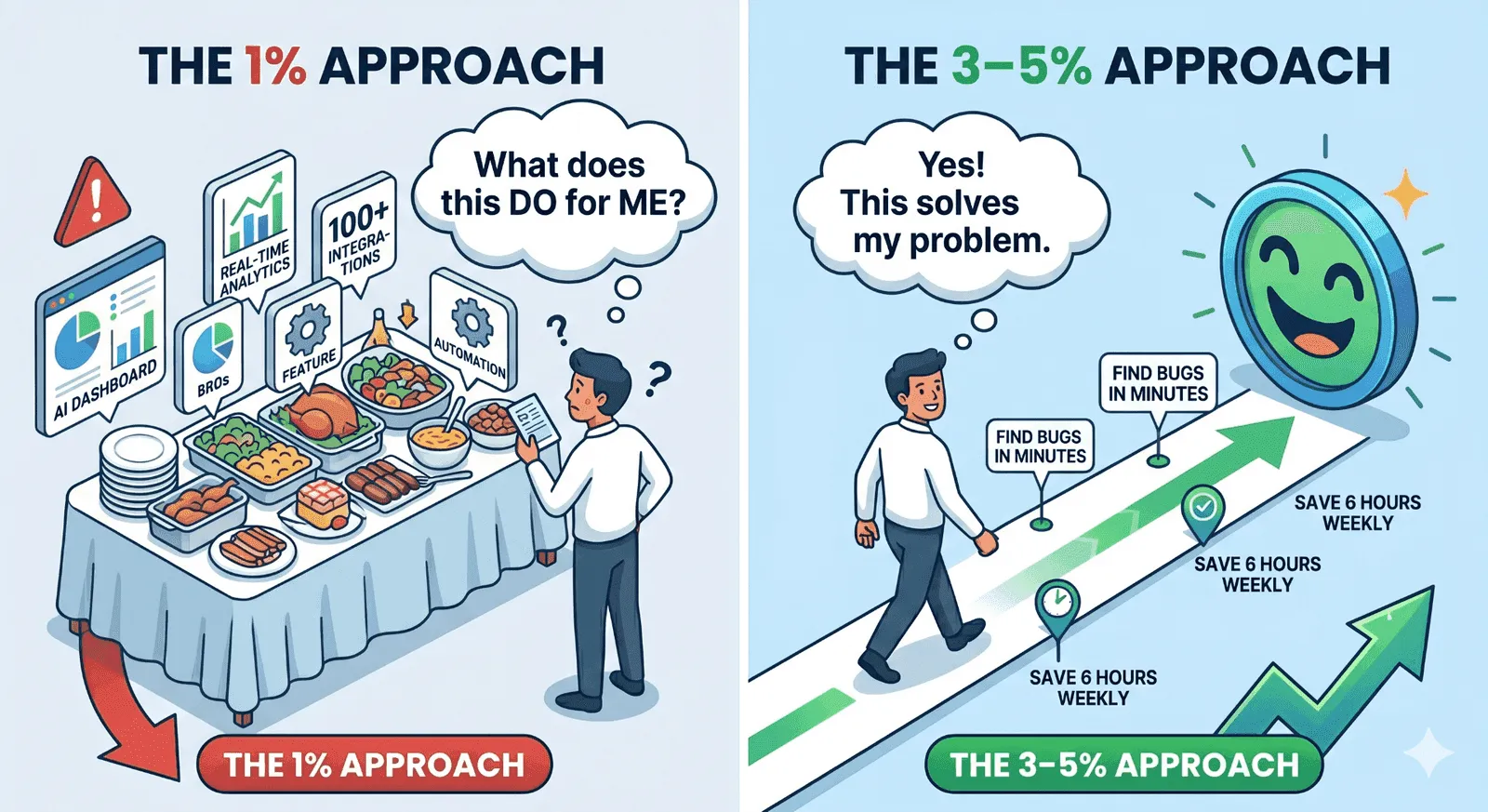
3. You're Selling Features Instead of Solving a Single Job
Feature lists are easy. That's why most pages turn into: dashboards, integrations, AI, automation, more dashboards. But your visitor is trying to hire you for a job:
- "Help me stop wasting ad spend."
- "Make my next round easier to raise."
- "Keep our first enterprise customer from experiencing outages."
Instead of leading with a feature buffet, anchor around one core job. Use copy like:
- "If you're trying to [achieve X] but stuck because [obstacle Y]…"
- "Most founders and marketers we talk to are wrestling with [problem A, B, C]…"
- "Here's how we take you from [unacceptable now] to [better future] in [time frame]."
Then connect features directly to outcomes:
- "Real‑time dashboards"
- "See CAC, LTV, and payback in one place — so you can adjust spend before the month is blown."
- "AI workflow automation"
- "Stop manually stitching data from 4 tools. Get a daily 'what changed' summary you can act on in 5 minutes."
People don't want features. They want fewer headaches and clearer wins.
4. You're Low on Proof (Especially Above the Fold)
At 1% conversion, there's almost always a trust gap. You know your product is good. Your visitor sees: "Another nice‑looking landing page claiming big things." Close that gap fast — move proof above the fold:
- Logos — even smaller clients or pilots, if you have permission. "Used by teams at…"
- Short, specific testimonials — "Cut our weekly reporting from 6 hours to 45 minutes in week one."
- Early numbers — "In our first 12 clients, we improved trial‑to‑paid by [your measured figure]."
- Founder credibility — "Previously led growth at [X]; helped [Y] go from [metric] to [metric]."
Avoid vague proof ("customers love us") and focus on concrete outcomes and small, real stories. If you don't have logos yet, use:
- Before/after bullets
- Annotated screenshots ("This is the report you'll actually see")
- Your founding story and why this problem matters to you
5. You're Making People Think Too Much
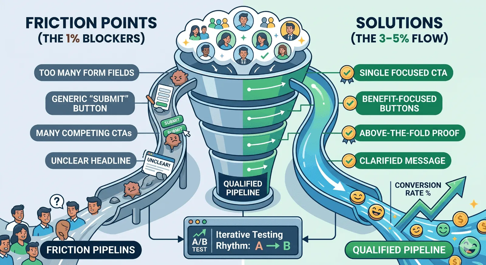
Mental effort kills conversion. Typical low-converting pages have full site navigation and many escape routes, long dense paragraphs, and multiple competing CTAs ("Subscribe," "Learn more," "Book demo," "See pricing"). A busy founder or marketer will not lovingly decode your value proposition.
Design for scanning:
- One primary CTA on the page ("Get my teardown," "Start free trial")
- Clear section labels: Who this is for · The problem · How it works · What you'll get in 30 days · Proof it works
- Short paragraphs (1–3 lines)
- Bullets wherever possible
If an element doesn't help someone say "yes" or "no" to your main offer, consider cutting it.
6. Your Form and Button Copy Add Friction at the Worst Moment
You can have great messaging and still lose people at the form. Two common problems: forms that feel nosy (too many fields, no explanation) and buttons that feel like work or risk ("Submit," "Book demo"). Tighten both.
On the form
- Ask only what's needed to deliver value soon.
- Explain any potentially sensitive field. "We ask for company size to tailor benchmarks to your stage."
On the button
Change label text from generic actions to outcomes:
- "Submit" → "Get my growth teardown"
- "Book demo" → "See how this would work for your funnel"
- "Sign up" → "Start my 14‑day trial"
You're not just changing a word — you're reframing the perceived cost vs benefit of clicking.
7. Your Traffic and Message Don't Match
Even a solid page will underperform if the traffic isn't right — or if expectations are mismatched.
Example:
Ad promise: "Free template to plan your SaaS launch"
Landing page: "Contact our sales team"
→ Mismatch → confusion → low conversion.
For each traffic source, check:
- What was promised? Ad copy, email subject line, social post.
- Does the hero section continue that promise? Same language, same outcome, same level of commitment.
If you run multiple campaigns, create variants. Reuse the problem statement or key phrase from the ad in the headline. Adjust the offer so it's the obvious next step from the click. A lot of "conversion problems" are really "expectation problems."
8. A Quick Note on SEO and Traffic Quality
Conversion optimization only works if the right people are landing on your page. If your landing page is converting at 1%, sometimes the core issue isn't only the page — it's who is arriving and why they showed up.
This is where SEO and content quietly matter for early‑stage teams:
- Intent: Are you showing up for searches that reflect the problems you actually solve? Strong: "improve SaaS landing page conversion," "B2B demo page examples." Weak: broad, unfocused topics that pull in people who will never buy.
- Promise match: Do your search snippets and content titles set the same expectation your landing page fulfills?
- Depth: Are your blogs and resources genuinely helping founders and marketers, or written just to check a keyword box?
You don't need a massive SEO program at an early stage. You do need a short list of high‑intent topics, content that actually answers them, and landing pages that continue the same story. Good search and content get the right people to the door. Good landing pages make sure they don't walk back out.
9. You're Guessing Instead of Testing
A final pattern: big, infrequent, hard‑to‑measure changes — full redesigns, total copy overhauls, new pages built from scratch every few months. You might get lucky, but you don't really learn why something worked.
Adopt a lightweight testing rhythm instead:
- Pick one key metric per page (demo requests, trials, email opt‑ins).
- Instrument the basics: visits, conversions, conversion rate by channel, a simple event for your main CTA.
- Test meaningful changes, not button colors: headline + subheadline, above‑the‑fold structure, offer type (demo vs teardown vs trial), form length + button copy.
- Run tests long enough to see direction. For lower‑traffic pages, test sequentially (A then B).
You're aiming for clear, directional learning — not textbook‑perfect statistics.
How Aaj Typically Helps Early‑Stage Teams
At Aaj, we work with founders and marketers at early‑stage companies that look like this:
- You've built something genuinely useful.
- You're starting to spend on ads, outbound, or partnerships.
- You're getting traffic — but not enough qualified pipeline.
- Your landing page feels "fine," but the numbers disagree.
When we engage, we usually start with three levers:
- Clarify the core promise. Position around the most urgent job your best customers hire you for.
- Rebuild the hero section and offer. Align headline, subheadline, and CTA with the visitor's moment and the channel that brought them.
- Surface credible proof. Even at early stages, there's almost always more evidence than you think — stories, numbers, screenshots, founder experience.
From there, we help you set up a simple testing and content rhythm so landing page conversion moves from ~1% toward 3–5%, cost per qualified lead drops, and you understand which audience and message actually drive pipeline.
A Simple 7‑Day Plan to Move From 1% Toward 3–5%
- Audit — Pick your highest‑traffic landing page. Note main traffic sources, current conversion rate, primary promise, and CTA.
- Fix Above the Fold — Rewrite headline (clear outcome for a specific audience), subheadline (how you deliver), and primary button (benefit‑focused). Add 1–2 proof elements above the fold.
- Reduce Friction — Remove extra navigation and secondary CTAs. Shorten your form and add helpful microcopy. Check that the promise from the ad/email/social post matches the first screen of the page.
- Ship and Observe — Publish changes and mark the date in analytics. Track conversion for 2–4 weeks. Plan your next big, meaningful test (e.g., new offer type, different hero framing).
You don't need a new brand, a full redesign, or a huge SEO program to move from 1% to 3–5%. You need sharper messaging around a specific job, an offer that matches the visitor's level of trust, proof that feels real, and traffic that arrives with the right expectations.
Ready to Move From 1% to 3–5%?
If you'd like help applying this to your own pages and traffic mix, this is exactly what Aaj does with early‑stage founders and marketing teams. Let's audit your highest‑traffic page together and identify the 2–3 changes that will move the needle fastest.
Sources & Further Reading
The insights in this article draw on research and thinking from these reputable sources:
Unbounce — Conversion Benchmark Report
Annual benchmark on landing page conversion rates across industries, with median and top-quartile figures for B2B SaaS, services, and lead gen.
https://unbounce.com/conversion-benchmark-report/ →
WordStream — Google Ads Industry Benchmarks
Reference data on conversion rates by industry for paid search and paid social, useful for setting realistic landing page targets.
https://www.wordstream.com/blog/ws/2023/03/01/google-ads-benchmarks →
Nielsen Norman Group — Landing Page Usability
Research-based UX guidance on hero sections, scannability, and friction reduction on conversion-focused pages.
https://www.nngroup.com/articles/landing-page-design/ →
CXL — Conversion Optimization Research
In-depth articles on value propositions, testing methodology, and copywriting for high-converting landing pages.
https://cxl.com/blog/ →
Baymard Institute — Form & Checkout UX Research
Empirical research on form length, field copy, and friction points that impact conversion rates.
https://baymard.com/research →
HubSpot — Landing Page Best Practices
Practitioner guidance on hero copy, CTAs, and proof elements with examples from high-converting B2B pages.
https://blog.hubspot.com/marketing/landing-page-best-practices →
Reforge — Growth & Conversion Essays
Strategic essays on message-market fit, offer design, and the role of landing pages in a broader growth motion.
https://www.reforge.com/blog →
More in Website & Conversion
Part of the Website & Conversion hub - see all 7 resources on this topic.
- AI agent skill: Website Conversion Audit
- Free tool: Website Grader
- AI agent skill: Marketing Psychology
- AI agent skill: Landing Page Brief